
EPICURIOUS
Reduce the time spent searching for a recipe by adding customized filtering and substitute features
My Role
UX Research/UX Design
Tools
Figma, Maze, Slack, Miro, Google Forms
Duration
3 Weeks
Background
Epicurious is the most trusted cooking brand in the world. Since 1995, Epicurious has been the ultimate food resource for the home cook, with daily kitchen tips, fun cooking videos, and, over 33,000 recipes.
How Did It Start?
After reading all of the Epicurious app store reviews, I saw the opportunity to improve recipe-finding experiences so that people can have more customized recipe suggestions with less time and effort with end result of a higher conversion rate.
Problem and Why does it matter?
People spend too much time and energy finding recipes that speak to them, especially the ones who have food restrictions. This problem causes user frustration while interacting with the recipe apps and increases the abandonment rate.
In 2021, approximately %44 respondents in the United States (U.S.) stated that they have cooked more often since the start of the COVID-19 pandemic. This resulted in a constant search for new recipes or ideas about what to cook. Epicurious has over 33000 recipes; thus, it's more challenging to find the right recipes to cook in daily life.
Solution
Redesign the app's searching recipe experience by adding filtering and substitution features to provide more customized recipe suggestions.
Problem Space
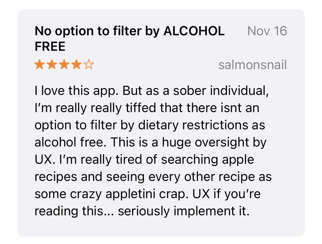
As a consumer, I constantly have difficulties finding a recipe in cooking apps: either the ingredients aren't compelling, or I'm overwhelmed by the amount of choices.I wanted to gather more generalized data about the problems in cooking apps, so I started from the App Store reviews about Epicurious to explore existing users' pain points. While there were a lot of reviews about how people love the recipes inside the app, although a lot of people were still complaining about how difficult to use the filter bar and how it’s not possible to find recipes based on their preferences.

The paint point patterns explored by the existing users lead me to the assumption that:
📌 ‘‘ People spend too much time finding recipes because of the lack of customizing recipes and filtering options’’
How do competitors solve this problem?

Dive deep into the problem…
Qualitative Research to understand users
To validate/invalidate my assumption and a better understanding of why and how users are communicating with the cooking apps, I conducted global remote 1:1 user interviews with people who interact with cooking apps at least once a week . To begin, I created research plans in order to maintain consistency across the interviews.
Let’s meet our participants..

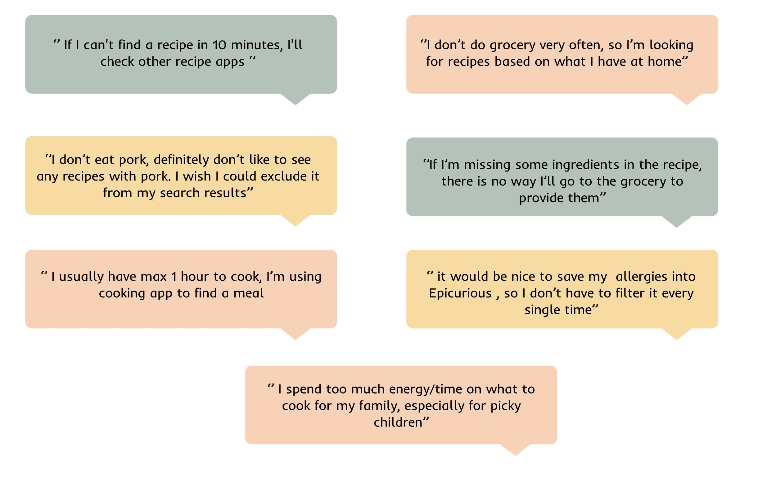
Users’ Problems: What they said..
Quantitative Research for greater understanding of the social world

What does the collected data say about people’s behavior?
87% of participants were frustrated by choosing recipes from hundreds of them.
83% of participants choose the recipes based on the household ingredients.
60% of participants grocery shop once a week and most likely cook with those ingredients throughout the week.
75% of participants either have a food allergy, dietary restrictions, or food preferences.
41% of participants rated cooking time moderately important in choosing a recipe.
Synthesize..
After learning why people spend so much time choosing recipes and, more crucially, how they choose those recipes, I validated my assumption.
Providing customized recipes is crucial to increasing customer satisfaction and decreasing the abandonment rate. People choose recipes based on ingredients, dietary preferences, circumstances, and mood. We can't control people's moods on what to cook, but we can give them the freedom to filter and search for customized recipes.
Check out the full Research Debrief.
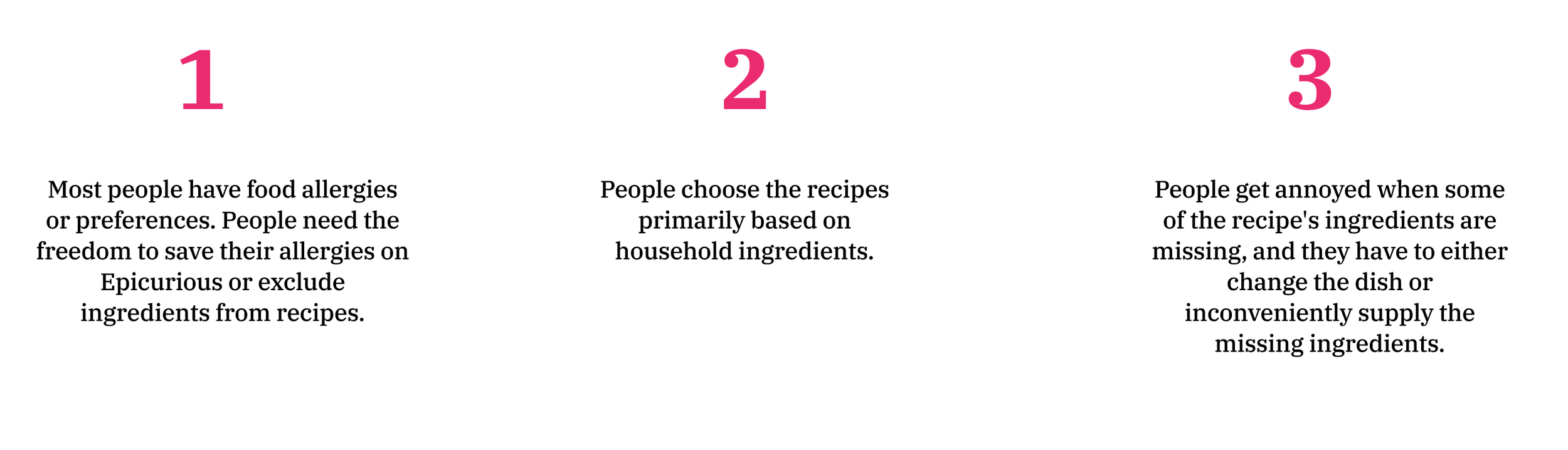
Here are some of the key insights
Empathizing with the User
Conducting seven user interviews and surveys allowed me to empathize with the proto-persona that I created. This proto-persona helped me to stay objective throughout all my design decisions.

Solution Space
Dive deep into the solution…
Until here, I had a clear understanding of the problem space , now it’s time to brain storm about ideation and explore the solution space.
How Might We…

Check out the POV Statement
Proposal for the Profile Setup
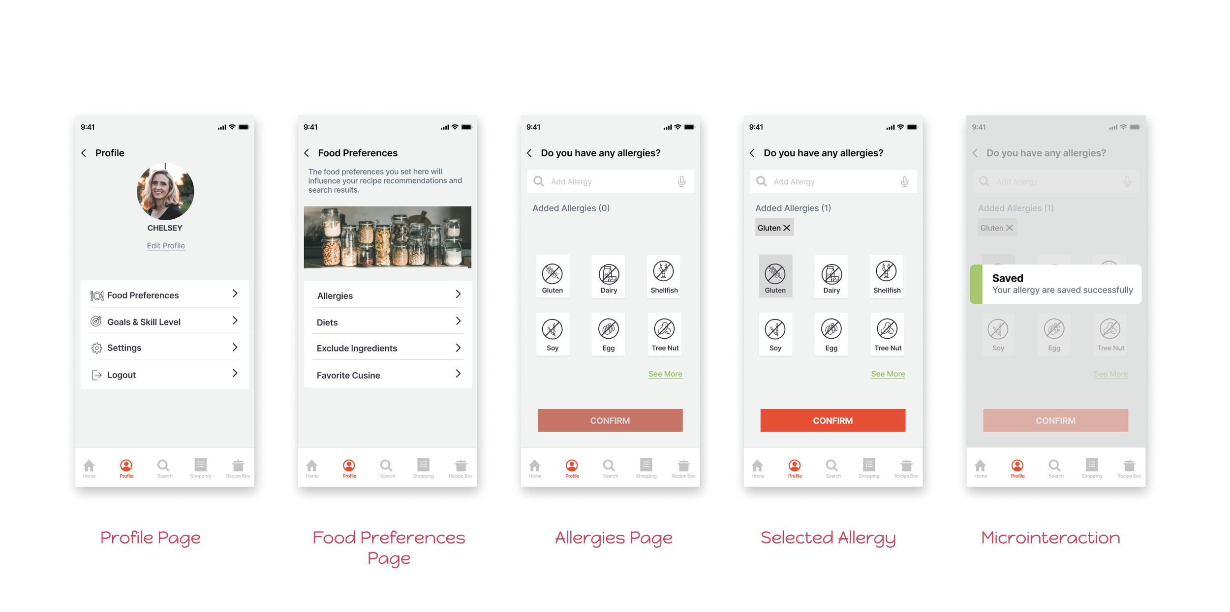
Since we are designing a customized experience to find a recipe, providing a profile setup is crucial.If the system could save Chelsey's food preferences, we could provide personalized recipe suggestions on the homepage. This will save time for users on filtering permanent conditions and it will also increase the pop-up conversion rate.
Information Architecture

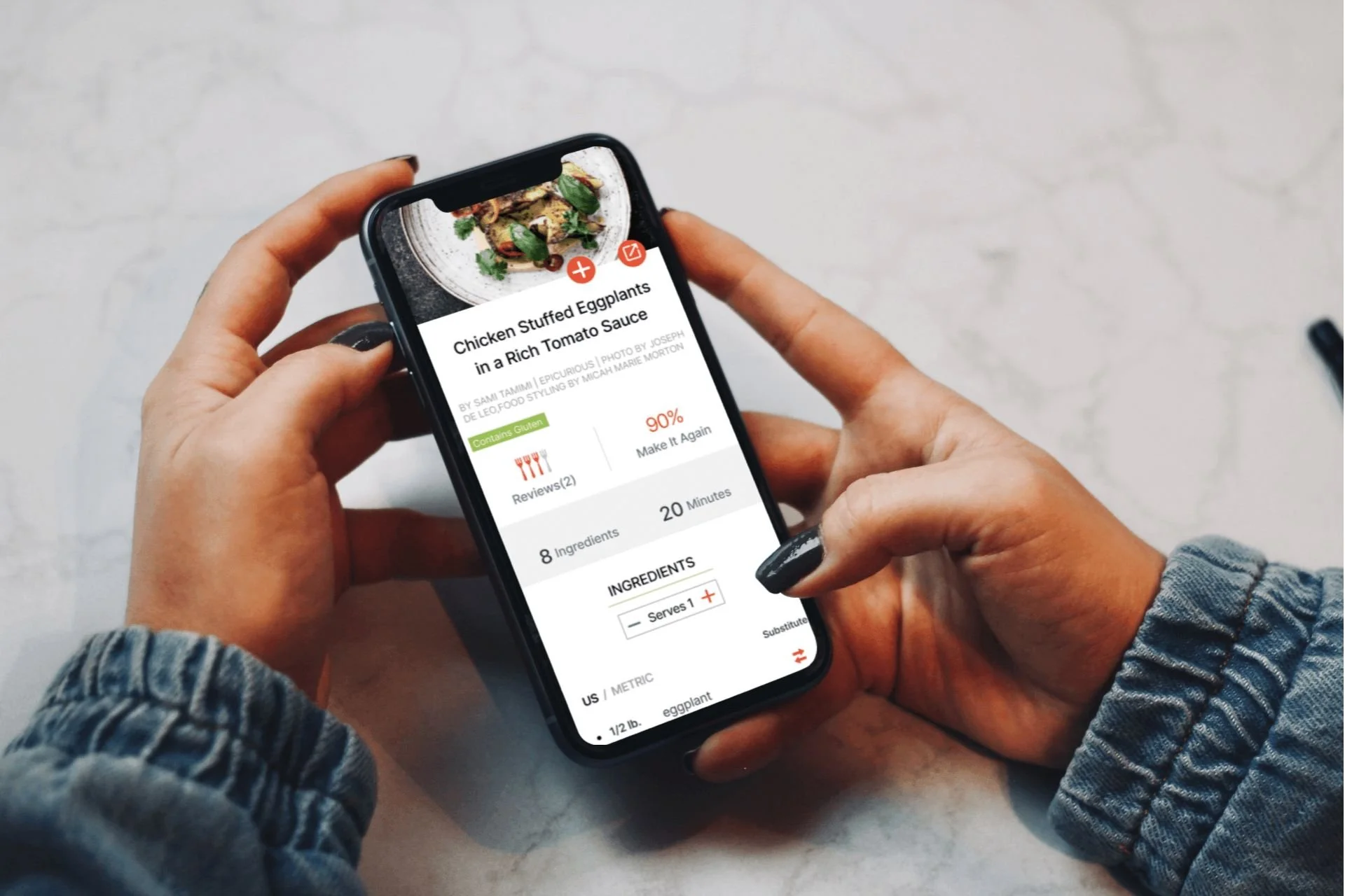
High-Fidelity Design
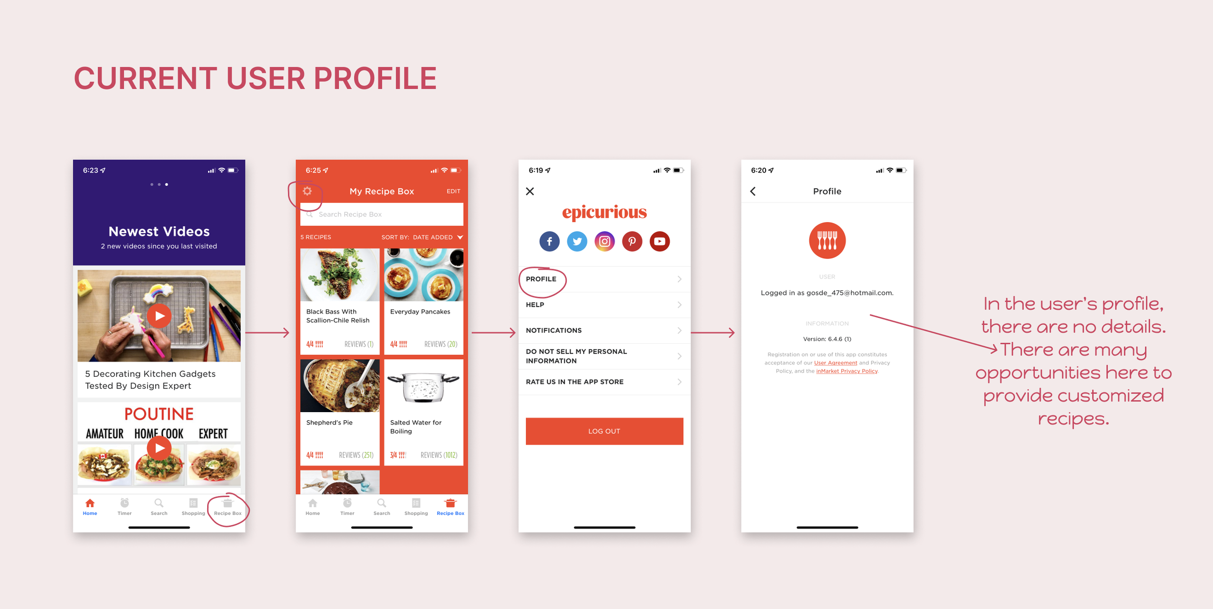
How could Chelsey save her gluten allergy into Epicurious, so that system can suggest gluten-free recipes or alert her if the recipe contains gluten?
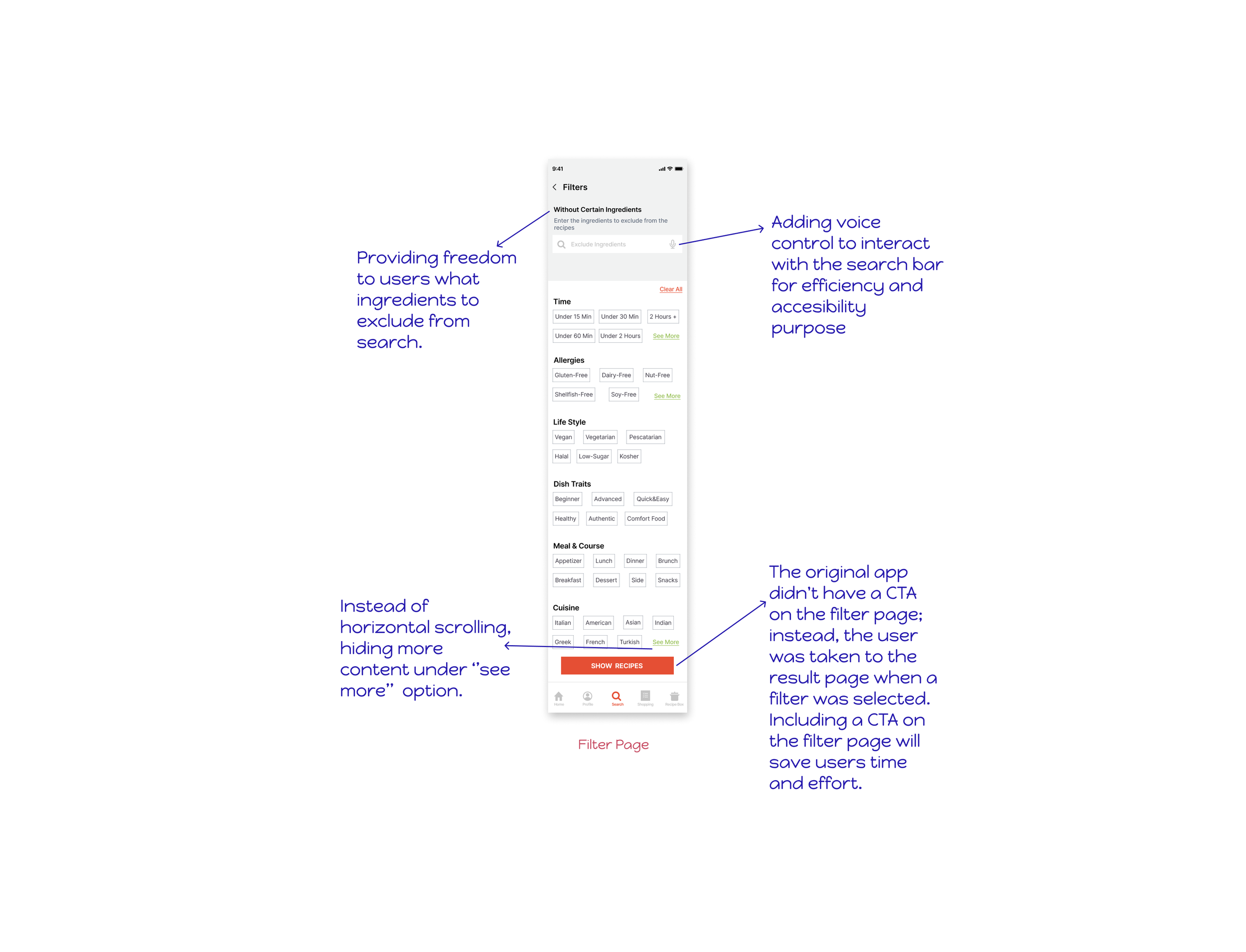
Proposal for Searching and Filtering

Design Decisions
If 83% of users prefer recipes based on their ingredients, giving the option to filter with household ingredients is the most significant way to cut down on time spent searching. This solution will also help users reduce food waste, save money, and improve product engagement.

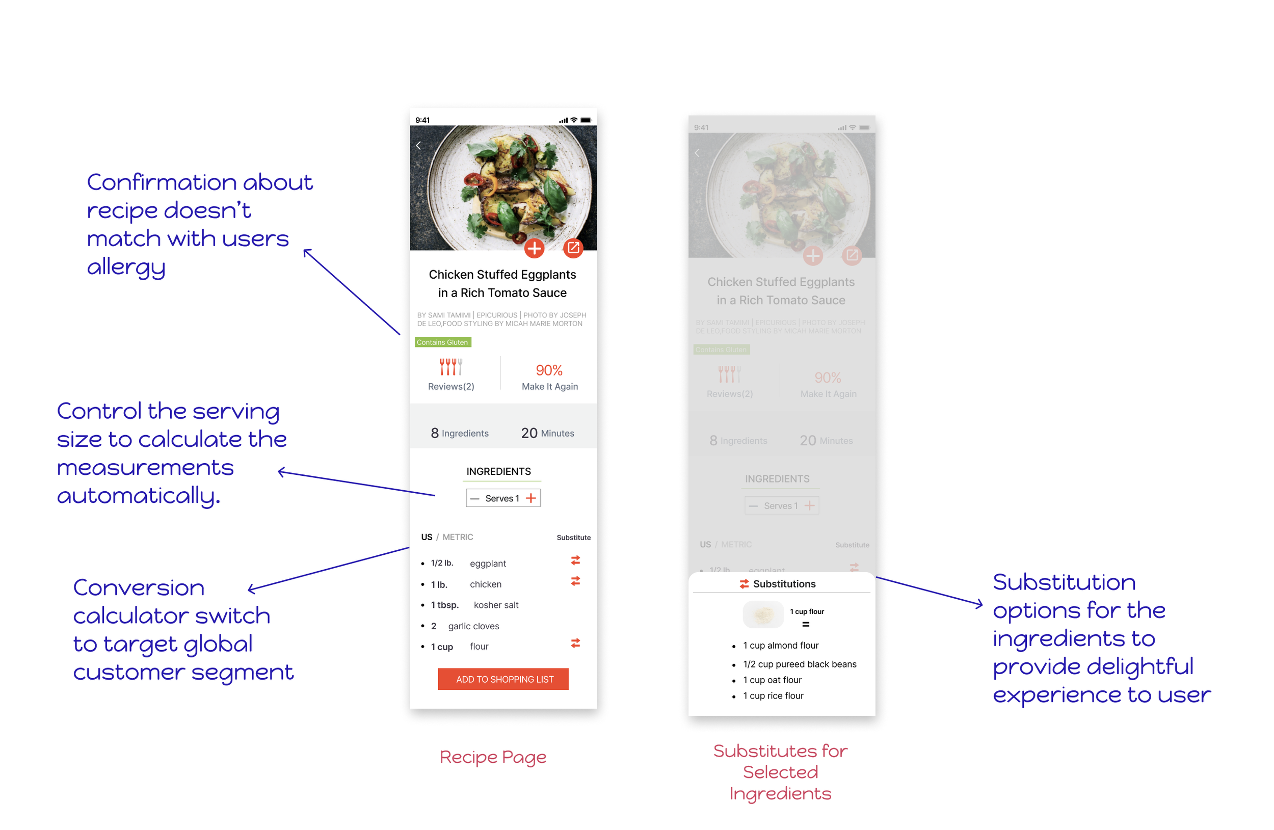
Proposal for Recipe Page and Substitute

PROTOTYPE
Validating the Design with Usability Test
At this point, I was excited to test the prototype and get user feedback. I wanted to test a couple of tasks here:
1.How easy to save an allergy to a user’s profile?
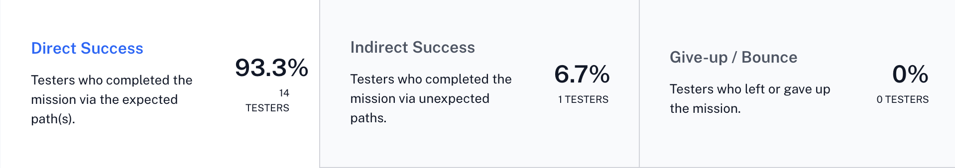
2.If users have limited time and ingredients, how to filter the recipes?
3.How easy to find substitutions for the ingredients on the recipe page?
Important Findings…
🙂 There are more people than thought who have food restrictions and preferences, 10 out of 15 participants mentioned how substitution features would make their lives easier.
🙂 Win! Since most participants were unfamiliar with the substitute icon, they could still figure out what it meant.
🙁Some users thought the filter button was defaulted because of the grey color.
🙁Some users had a hard time finding where to input household ingredients. Some of them were expecting it under the filter button.